Previous page : Data analysis 1, linear relations, Zooming in, but not through the origin
Next page : Data analysis, part 3, non linear Data
More linear Data
In the previous example, we analysed some data that could be assumed to be proportionality. In this example, we will analyse some data that is linear, but not a proportionality. Say we have done some measurement of how some physical quantity A is dependent on some other physical quantity B. Say that the error in B is rather small, so it can safely be discarded.
The data can be found in the file analysis2 V3
In this, it is assumed you have read through at least Data Analysis 1, linear relations, proportionalities.
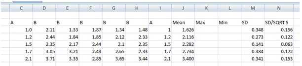
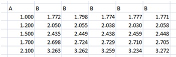
We have the following measurements and the first few calculations.
We do a plot of A (column I) vs. the Mean (column J), using the SEM=SD/ SQRT 5 as our error.
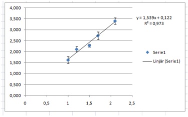
This reveals that we might have a linear relation.
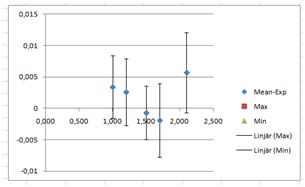
Next, we add the points for the max and min slope. To facilitate this I have added a couple of columns between the Mean and SD column. If you have missed that then you can do this by selecting a column (click on the letter at the top of a column) and then right-click and then add a column.
I added values large and small enough to be outside the range.
 A plot of the A through Min columns gives us (with trend lines added):
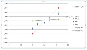
We then change the values in the Min and Max columns to make the lines fit through the error bars. It might be a good idea to enlarge the graph as you do this.
This is what I got after some trial and horror.

It is usually a good idea to try to make the lines cross somewhere in the middle of the domain. Anyhow, as we can see, it is not possible to make reasonable lines go through the error bars. We have yet again a situation where the error when dividing by the square root of the number of measurements gives us too good values. I will thus resort back to using the SD value. If you do so it must be mentioned and discussed in your work.
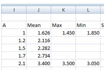
The values I used were:
 These I found, as before, by some tweaking of the values until I got a reasonable fit. This will give us the graph:
 The error bars are now from using the SD values.
Next, we need to find the equation of the straight line, with errors.
Let’s look at the slope first. We have the slopes 1.09 and 1.863. The average of those will be our slope and half the distance between them will be our uncertainty. This will, after rounding, give us 1.5±0.4.
Next, we do the same with the “y”-intercept. We have –0.413 and 0.759. This gives us 0.2±0.6.
From this, we will get the relation
B=(1.5±0.4)A –0.2±0.6
We may thus have proportionality, but probably not.
Higher accuracy
Had I got the data above I would not be all too satisfied. The errors are rather large. Ok, say that, after turning to CERN, NASA and the Illuminate, I got a grant of 2.2 billion Euro to spend on better equipment, and after spending about 500 000 of those Euros on the mentioned equipment (and for the rest – who knows), and after repeating the experiment getting the following data, will I then know a bit more about the relation? Let’s see. We now have the data:
Some calculations later we get this:
 From this, we get the graph:
 At this scale, the error bars are simply too small to see. To enable us to work with the errors we use the trick from Data analysis 1, linear relations, proportionalities, Zooming in. We start by making a new column with the values of the means of B minus the expected value from the linear trend line we have just found by adding a trend line. I.e.
B–(1.343A+0.432)
I would copy the A-values to the M column (using =, not copy and paste) then write =J3-(1.343*M3+0.432) in cell M3, and copy it down the column. I would then add a Min and Max slope column. This gives me:
 I would then plot the A through Min column, and add error bars from the SEM=SD /SQRT 5 column. This would give us unreasonable small errors, for reasons discussed in The Standard Error of the Mean, when does it work? I would thus use the SD values in this case. This gives us:
Then I would fill in suitable values for the Max and Min slope start and end points, add trend lines, and try to make the lines fit the data. This is what I got.
 This gives the graph:
 If we add back the slopes to our trend line
B=1.343A+0.432
we get the slopes 1.350 and 1.337. The mean is now 1.3435 and the error (half the difference) is 0.0065. Rounded up and to the correct number of decimals we get 1.343±0.007. Doing the same thing for the intercept gives us 0.40±0.05. We thus have the equation
B=(1.343±0.007)A –0.40±0.05.
This looks quite much better than the previous solution. Well spent 2.2 billion Euro I would say.
Anyhow, I made the data by the command (copied to other cells several times):
=ROUND(0.44+(RAND()*2-1)*0.02+1.34*$D18;3)
Here ROUND(….;3) rounds the value to three decimals. RAND() gives a random value between 0 and 1, and the D column holds the A values. The “correct” formula was thus
B=(1.34±0.007)A –0.44
Not too bad I would say, not too bad.
Previous page : Data analysis 1, linear relations, Zooming in, but not through the origin
Next page : Data analysis, part 3, non linear Data