Previous page : Data analysis 1, linear relations,not a proportionality
Next page : Data analysis 1, linear relations, Zooming in, but not through the origin
Zooming in
The data for this can be found in the Excel file Analysis 1-V4 , in the leaf The Data, 2.
In this case, described in the previous page it was rather OK to see how well it fitted, since the error bars were rather long, but sometimes really short, and then it can be really hard to find the two lines we need. Say we repeat the previous lab, but that we now have been able to find the cause of some of the errors. As we can see in the table below, the errors seem to be much smaller.
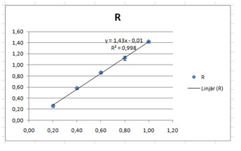
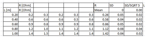 As before we started by adding a Mean, standard deviation and standard error of the mean. Next, we find a line of best fit. If we add error bars we can see that we cannot see the error bars in question.
 What we can do first is remove the expected average, i.e. we remove it from our data. We make two new columns, L and R– Rexp.. We then plot that including error bars. We can thus write “=I7-1.43*L7” in cell M7, and then copy it down. Those values will be very close to 0, or else something is wrong. This is what you should have now:

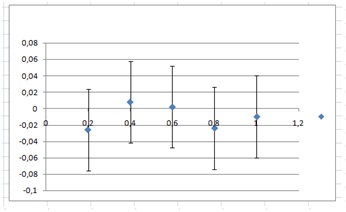
A graph of the last two columns, including errors (from the SEM, SD/SQRT 5 column) would give us:

As one can see, it is impossible to add trend lines going through the error bars without them being extremely close to each other, and it would be odd if larger variation of the data points would imply smaller errors in the final result. I guess that the / square root of 5 trick does not work in this case. And indeed, one has to be careful about using that trick. In this case, our measuring instruments were not capable of measuring better than one part in 0.1, and that means that we cannot get better results than within ±0.05 Ω. The trick works when we have some kind of random error on top of our measuring resolution. If we plot the graph again, but now with an error of 0.05 we get:
This looks much more useful.
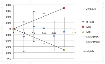
Yet again, given that the point goes through the origin, we add two columns:
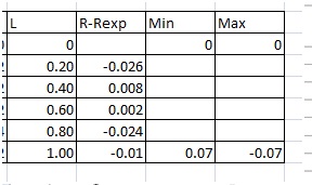
I selected the values 0.07 and –0.07 to clearly see the points.
Then we add trend lines and then we plot:
Next, we tweak our values to fit the error bars. One can see that +0.03 and –0.06 fits the data very well. This gives us an average of –0.015 with an error of 0.045, or –0.02±0.05.
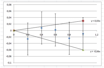
If we add this to our previous slope, 1.43, we get 1.41±0.05, and thus that
R=(1.41±0.05)L
This is consistent with our previous result R=(1.3±0.2)L
Previous page : Data analysis 1, linear relations,not a proportionality
Next page : Data analysis 1, linear relations, Zooming in, but not through the origin