Previous page : Analysis 4, errors on both variables
Next page : The Standard Error of the Mean, when does it work?
How to make a nice graph
If you have something like the below graph in your work, it might influence your marks under the “communication” criteria. What is the data presented? What are the data and the units?
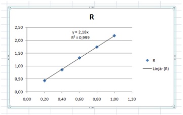 “Lineär”, that’s a strange word? And what are the x and the y in the equation? The graph creates more questions than it answers.
To start with we may choose a better Design. Select the graph, then select “Design” and there you select a design that you think is OK. Select the one closest to what you want. You can tinker with the details as you go.
I selected this:

Next, I removed the dot and the “R” to the right, and added error bars. I also changed the point size and colour. This you can do by right-clicking on a point and then editing the properties of the point. Next, I added a trend line, with the equation and the R2 value. This gave me:

Next, I edited the equations to reflect that we have R and L, not y and x. We do this by a left click on the equation, and then we can simply edit it. We can also move it to a better place. (In the figure text that we will add later, we need to mention the R2 value, since it might be confusing that we have both R2 and R.).
Then we need to change the axis labels. For the Ohm sign, I added it to a Word file (Insert, Symbol, Ω) then copied that and pasted it into the label. Left-click the label to edit it. We can change the properties of the text as usual under Home, Font (Start, Tecken in the Swedish Word).
This will finally give us something useful:
 Figure 1: Resistance versus length in our wire. Error bars and a linear trend line were added to the data, and the equation for that line. R is the resistance and the R2 value is the Pearson correlation coefficient. A simple linear proportionality is seen.
Observe some small details, as that I have changed the font to Times New Roman since that is what I use in the rest of the text. A Figure text is also added, and it should be informative, and to the point. The reader should not have to search in the main text to be able to somewhat correctly interpret the figure. Figure and picture descriptions are usually written with a smaller font size than the main text. In this case 10 points vs. 12 points.
I just noted that I have missed changing the variable names in the equations and also the R to italics. Ok, so nobody’s perfect.
Previous page : Analysis 4, errors on both variables
Next page : The Standard Error of the Mean, when does it work?