Previous page : Data Analysis in lab rapports and explorations
Next page : Data analysis 1, linear relations,not a proportionality
Data Analysis 1, linear relations, proportionalities
In the Excel file Analysis 1-V4 under the leaf “The Data, part 1, I” you will find some data, that are supposed to be the data of some experiment where you are supposed to find the resistance vs. the length of some wire. The length is measured to the nearest mm, and the resistivity to the nearest 0.1 Ω. The error in length inherent in the measurement is thus ±0.5 mm, and in resistance, ±0.05 Ω. The error in the dependent variable is usually larger due to various random, or possibly systematic, errors. The error in the independent variable (say the length you select) is usually quite small.
The question could be to find how the resistance varies with the length. Since we expect the resistance to approach 0 as the length approaches 0 we will expect a straight line through the origin, i.e. a proportionality.
Our goal is to find an equation of the form
R=(m±uncertainty in m)L
where m is a constant.
I suggest you try to work yourself through the steps on the data in the first leaf and use the second leaf named “The analysis part 1” as a key.
This is our data
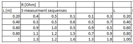
Step 1: Find the average and the standard deviation of the resistance in each row.
In English Excel, you do that using the functions AVERAGE and STDEV.S Also, set the number of displayed figures in the calculations to something suitable. In this case, say 2. You can do this by selecting the cells, right-click, then select Format Cells, Number, and then you can set the number of decimals to say 2.
You will quite often find that this new error estimate is in fact in error, especially if you have as few data points as 5. It is rather good to have a discussion about this in your work if this happens. The chance for the average to deviate far away from the expected average is simply rather high if we just have a few values. In this fi
We now have:
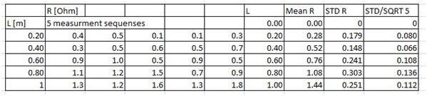
I have added zeros on top of the L, Mean, STD R and SD/SQRT 5 columns (more on the last one at the end of this section), this is because we are (most likely) dealing with a proportionality, and hence the graph will go through the origin, with an uncertainty of 0. We will use this later on.
I have also copied the length data and the average resistance data to two new columns. This is to simplify the next step, plotting the data. I would though not just copy and paste, but instead use “=”. Given the Excel file we have I would make the I column my new L, then click I7, write “=” then select C7, Enter. This would make the cell K7 have the same value as C7, even if I later change the value of C7- this is to keep my data consistent.
I can then select the cell, I7, right-click on the lower right corner, drag down, release the key, and select “Copy cells”, or left-click, drag down and release.
Next, I do the same thing in the J column but with the mean R values. I would thus have “=AVERAGE(D7:H7)”
The standard deviations we get should be somewhat consistent with the supposed accuracy of the instrument. If not, then some other error might have crept in. In this case, the standard deviation does vary quite much more than the estimate we had (0.05 Ω) and indicates that we have some more sources of error than the pure measurement errors from our instrument. In this example, the errors are ridiculously high, but this is just to make it easier to see.
Step 2: Plot the data.
Select the two columns for L and R, including labels, then make a scatter plot. To do this, on the Insert tab, in the Charts group, choose Scatter, and select Scatter with only Markers. (In Swedish Excel: Infoga, then under Diagram select Punkt.). You should now get something like this
 The relation looks rather linear. To test this we right-click on a point and select to add a linear trend line. Select to show the equation and also the R2 value.
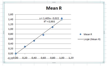 An R2 value of 0.993 shows us that it is indeed close to linear and with a slope of 1.4 Ω/m. The relatively small “y“-intercept value of 0.022 shows us that we indeed might have a proportionality.
Important: The above graph is useful in your analysis, but not if you intend to use it in your exploration. There are several problems with it. We don’t have any axis labels, no grid lines, and the equation is expressed using x and y. We will look at how to make a nice graph later on.
Hmm. But this is the value without possible errors. We can start making a new graph and adding some error bars.
So, again, select the two columns for L and R, including labels and make a scatter plot as above. Next, click the Chart Elements button next to the chart, and then check the Error Bars box. You might also get here under Layout, Error bars. Next, you select Custom, and Pick More Options to set your error bar sizes, and then under Vertical Error Bar or Horizontal Error Bar, choose the options you want. In the end, you want to be able to select custom error bars. When I do it I get something like this:

This might look slightly different depending on the version. Change the values by writing ”=” and then select the SD/SQRT 5 column. In this case, we will use the same value for the positive and negative values. This may give you something like this:

If you get horizontal error bars, just select one of them and press Delete to remove them. This will give us something like this:

Next, we need to add lines with the largest and the smallest possible slopes. In this case, we know the line should go through (0,0), so we will use that as our starting point. Then we add the endpoints. This we do by adding values in two additional columns. I have also added a new row for the length 0. One also needs to add a zero at the beginning of the SDT R column, to make it have the same number of rows.
Important: Give the two new columns labels, or headlines (like Min and Max) else plotting does not work as intended (I have no clue why). Se to that all columns have labels, then select the columns including the labels, and then do a scatter plot. Excel will then use the first column as the “x”-values, and plot the data from the other columns vs. that. If you don’t have labels, it will use “1,2,3…” as “x”-values, and plot all the columns against those values.

I have added values in the last row that are small enough and large enough to clearly be outside the values we will use in the end – this to make it easier to select the points.
If we now select the four columns, make a scatter plot, and add back the error bars (here we now need to use all values (including the 0) in the SDT R column) we get:

We then add the lines for the min and max slopes. We do this by selecting, say the upper green point, and then add trend line. We do the same with the red point. Don’t forget to include the equations.

Next, we change the top max and min values to fit the error bars. I started by simply using the values at the endpoints. 1.41–0.25=1.66 and 1.41+0.25=1.16. The 1.41 is the slope of the trend line and 0.25 is the standard deviation of the last point. This gives us:

The upper line looks quite OK, but the lower one looks a bit too high up. It is OK if you miss some error bars since we are talking about standard deviations, and for a normal distribution, the chance of a value being inside the error bar is about 70%. We will have to find some kind of best fit, that still somewhat fits the spread of our data. This is what I got:

The lowermost line misses the endpoint’s error bar a bit, but it will, on average, fit the rest of the error bars better. This is for the values:

If we have two values at the end of an error bar, then the average is the midpoint, and the distance between the values divided by two will give us the ± value. We will use this method over and over again.
The actual values you use are not that critical as long as the lines fit the data somewhat. The reason for this is that we will round the uncertainties to one significant figure. If you get an uncertainty of ±0.062 or ±0.086 does not matter. You will round it to ±0.1 anyhow.
We thus have a slope between 1.1 and 1.65. This would give an average of 1.38. Half the difference would give us the errors, ±0.28. We round that up to one significant figure, i.e. to ±0.3. We then round the average to the same decimal position, to finally give us the slope 1.4±0.3. The equation of resistance vs. length would thus be:
R=(1.4±0.3)L
If this was a part of an IA in physics, and you would have done the above analysis (without all my words) then you would be a long way in fulfilling the criteria mentioned in the beginning.The only thing though is that the measurements in thus case is rather bad, with huge uncertainties,
Addendum: If we have a large number of measurements for a given input we may find it better to use something called the standard error of the mean (SEM) instead of the standard deviation for our error bars. In this case, after we have calculated the standard deviation, we then divide it by the square root of the number of measurements at a given input value, in this case, 5 measurements. This is because it is reasonable that the more measurements we do, the better we know the actual value, even if we have errors in particular measurements. For why we use the square root of the number of measurements, follow the link https://en.wikipedia.org/wiki/Standard_error.
I would say that is usually not useful for as few measurements as five.
In the following pages, both the standard deviation and the SEM will be used.
Previous page : Data Analysis in lab rapports and explorations
Next page : Data analysis 1, linear relations,not a proportionality